在浏览网站的过程中,偶然看到一个有趣的效果,有一圈旋转滑动的渐变色,围绕着一个框,做变速运动。就特别好奇是怎么实现的。所以就F12研究了一下。
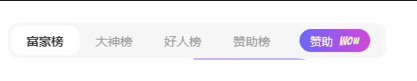
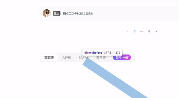
看了,一下不禁感叹他的奇淫技巧,其实就是 CSS @keyframes 自定义一个旋转一圈的效果。放在元素中的before伪类里面执行。外面包裹一层overflow:hidden 超出隐藏多余的。就可以实现这个变速光带的效果了。
代码如下:
<!DOCTYPE html>
<html lang="en">
  <head>
    <meta charset="UTF-8" />
    <meta name="viewport" content="width=device-width, initial-scale=1.0" />
    <title>Document</title>
    <style>
      .help-box .rank-title {
        position: sticky;
        bottom: 20px;
        margin-top: 80px;
        padding: 2px;
        overflow: hidden;
        height: 40px;
        width: 430px;
        border-radius: 12px;
      }
      .help-box .rank-title .w {
        display: inline-flex;
        align-items: center;
        margin-bottom: 20px;
        background-color: #f7f7f7;
        border-radius: 12px;
        height: 40px;
        cursor: pointer;
        padding: 0 3px;
        position: relative;
        box-shadow: 0 0 20px 1px #fff;
      }
      .help-box .rank-title .w:before {
        content: "";
        position: absolute;
        background: linear-gradient(to bottom, #6b69f8, #d14bd8);
        width: 100%;
        height: 40px;
        z-index: -2;
        left: 50%;
        top: 50%;
        transform-origin: 0 0;
        animation: rotate 3s infinite linear;
      }
      @keyframes rotate {
        to {
          transform: rotate(1turn);
          /* 将元素顺时针旋转一整圈 */
        }
      }
      .help-box .rank-title .w:after {
        content: "";
        position: absolute;
        background-color: #000;
        width: calc(100% - 4px);
        height: calc(100% - 4px);
        top: 2px;
        left: 2px;
        border-radius: 10px;
        z-index: -1;
      }
      .help-box .rank-title .w span {
        padding: 0 18px;
        border-radius: 12px;
        height: 34px;
        font-size: 14px;
        display: flex;
        align-items: center;
        justify-content: center;
        cursor: pointer;
        color: #999;
      }
      .help-box .rank-title .w span.active {
        background-color: #fff;
        font-weight: 700;
        color: #333;
      }
      .sponsor-btn {
        background: linear-gradient(to right, #6b69f8, #d14bd8);
        margin: 0 15px;
        border-radius: 50px;
        color: #fff;
        line-height: 1;
        position: relative;
        padding: 0 42px 0 12px;
        height: 26px;
        cursor: pointer;
        display: flex;
        align-items: center;
      }
      .sponsor-btn img {
        height: 30px;
        position: absolute;
        right: 8px;
        pointer-events: none;
        max-width: 100%;
      }
      .medium-zoom-image {
        cursor: pointer;
        cursor: zoom-in;
        transition: transform 0.3s cubic-bezier(0.2, 0, 0.2, 1) !important;
      }
      .sponsor-btn .span {
        font-size: 13px;
        color: #fff;
        line-height: 1;
        cursor: pointer;
      }
    </style>
  </head>
  <body>
    <div class="help-box">
      <div class="rank-title">
        <div class="w">
          <span class="active">富豪榜</span><span>大神榜</span
          ><span>好人榜</span><span>赞助榜</span>
          <div class="sponsor-btn">
            <div class="span">赞助</div>
            <img src="./wow.svg" class="medium-zoom-image" />
          </div>
        </div>
      </div>
    </div>
  </body>
</html>